6 Website Elements to Remove from Your Website Right Now
As a business owner, your website is your digital storefront. If it’s not turning visitors into paying customers, you’ve got a problem. And guess what? The solution isn’t always about adding more stuff. Sometimes, it’s about simplifying. It’s about removing the website elements that are confusing your visitors or driving them straight to the exit.
So here are six things you should remove from your website to start converting more visitors into clients:
1. Crazy Color Schemes
Bright, bold colors can be fun—until they make your website feel overwhelming. If your website uses too many colors or mismatched shades, it can look unprofessional and confuse visitors.
Stick to 2-3 solid, brand-consistent colors, and use them sparingly for key website elements like buttons and headings. That’s it. A clean, simple color scheme makes your website look more polished and professional, and—surprise!—people will actually want to stay.
2. Complicated Navigation Menus
The goal is simple: Make it easy for visitors to find what they need. If they can’t, they’ll bounce.
When people land on your site, they shouldn't be questioning where to go next. A good rule of thumb is to limit your main navigation menu to five key items.

Anything that’s not directly related to getting people to take action? Move it to the footer.
3. Self-Centered Language
Your visitors don’t want to hear about how awesome you are. They want to know how you’re going to solve their problem. So, focus on them. Speak their language.
Skip the jargon or over-the-top sales talk. Focus on how your product or service makes their life better. That’s what gets their attention and keeps them engaged.
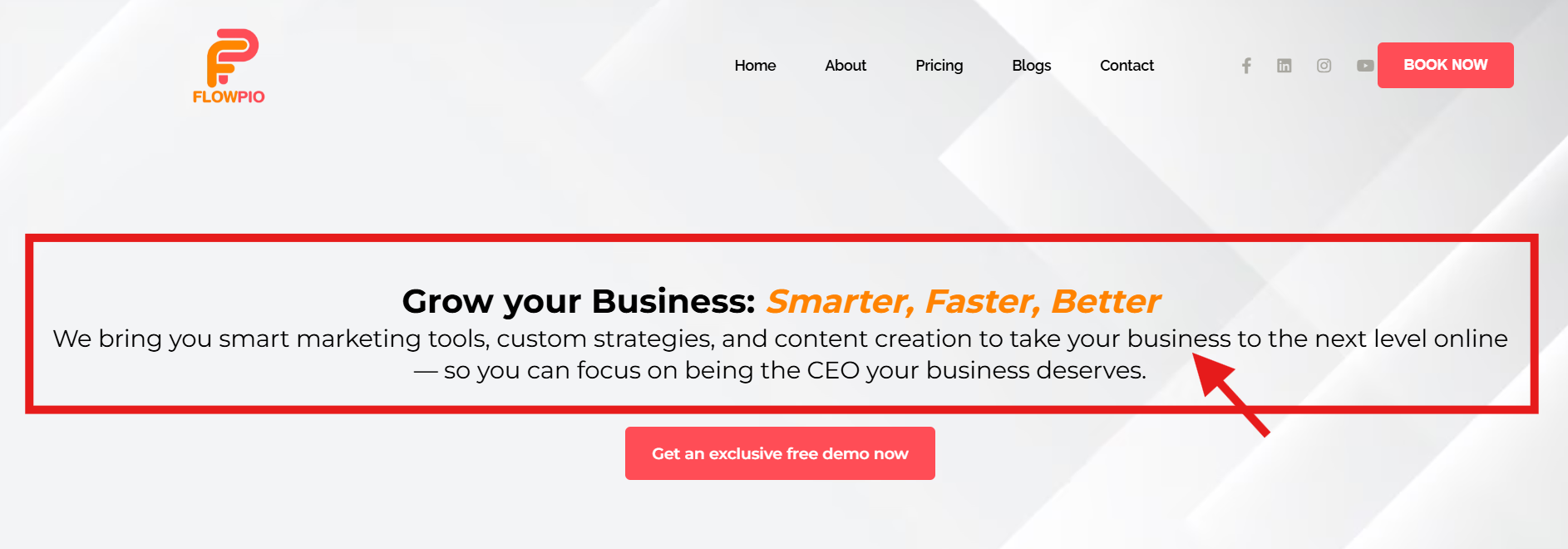
Take Fowpio’s homepage text–clear and straightforward. It effectively communicates the value of their services without relying on technical jargon.

4. Old Contact Us Forms
Traditional "Contact Us" forms are basically a black hole. People fill them out, then they wait, and they wonder if anyone will ever get back to them.
Instead, make it easy for them to book time with you using a direct scheduling tool like Calendly. It’s quick, efficient, and shows you respect their time (and your own). Plus, there’s less back-and-forth, which makes everyone happy.
Pro tip: Pay attention to the subscription costs of different tools. If you want to save some cash, look into all-in-one platforms like Flowpio, which bundle services like web design, CRM automation, and content creation into one nice little package.
5. Generic Stock Photos
People can smell fake from a mile away. If your website is full of stock photos, it’s going to feel... well, fake. And when it feels fake, your business looks like it’s trying way too hard, which kills your credibility.
Avoid that pitfall by using real, high-quality images that show actual people in real situations. Or if you’re on a budget, opt for AI-generated images or stock photos that don’t feel like they’re straight out of a model agency catalog.
The more authentic your images feel, the more trustworthy your site becomes.


6. Overly Detailed Team Bios
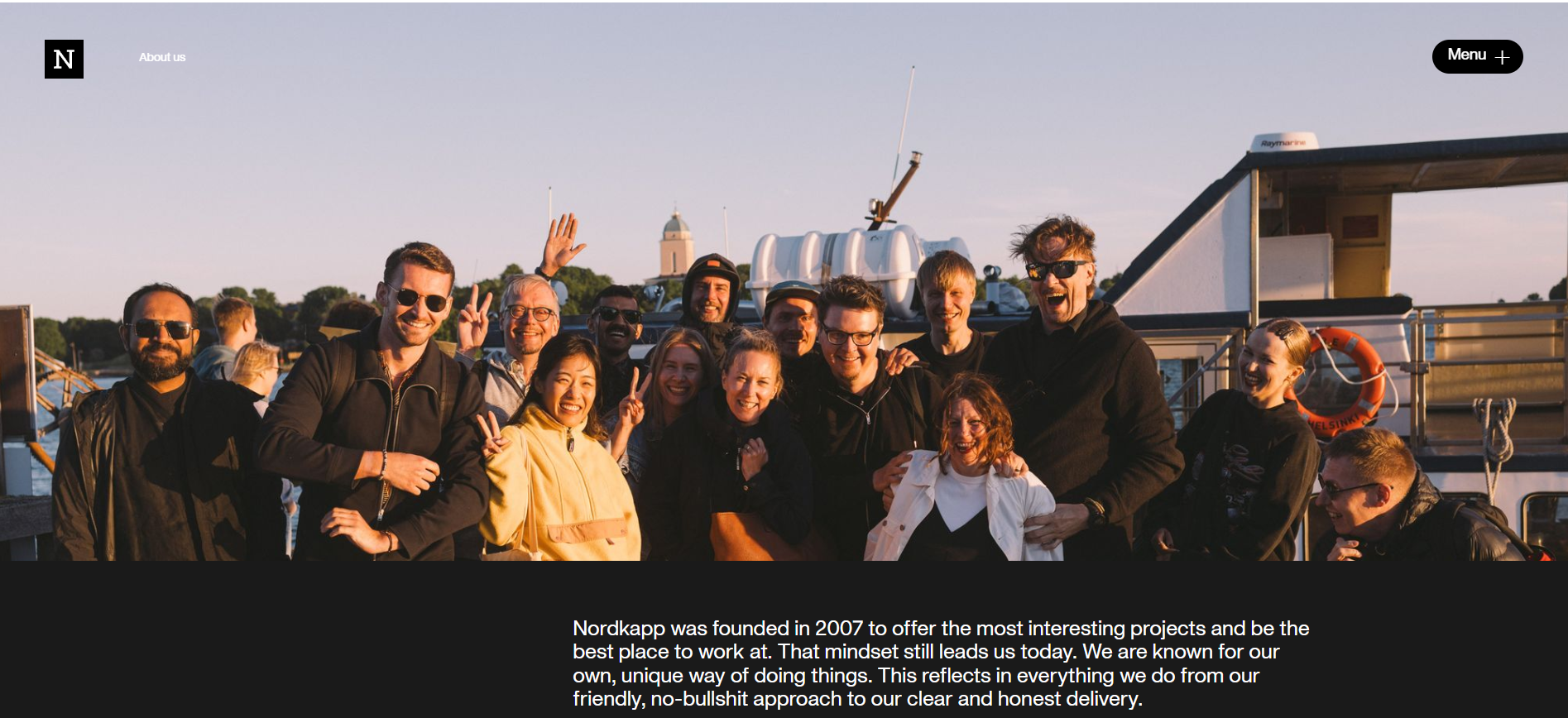
While it’s great to celebrate your team, detailed bios aren’t usually what visitors are looking for. Instead of long paragraphs about each team member, include a simple group photo to show that real people are behind your business.

Sample from Nordkapp
In the end, the goal is simple: You want your website to convert visitors into clients.
The trick is to keep things clear and focused. Get rid of the distractions, remove the confusion, and make sure your website screams, “I can help you, and here’s how you can work with me.”
Review your site, cut out the unnecessary noise, and start focusing on website elements that actually matter. Your future clients will thank you.

